Witchetty River Case Study- Test 3

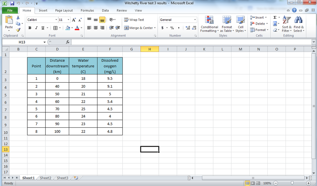
Water temperatures and dissolved oxygen concentrations were measured at all eight points along the river.
It is known that perch need the water temperature below 24 degrees Celsius and the oxygen concentration above 4 mg/L.
The results of the tests are shown in the table below:
It is known that perch need the water temperature below 24 degrees Celsius and the oxygen concentration above 4 mg/L.
The results of the tests are shown in the table below:

Your task: Draw a graph of the data in the table above
Before you do anything else, download and open the MS Excel spreadsheet below. It will look something like this.
| witchetty_river_test_3_results.xlsx |
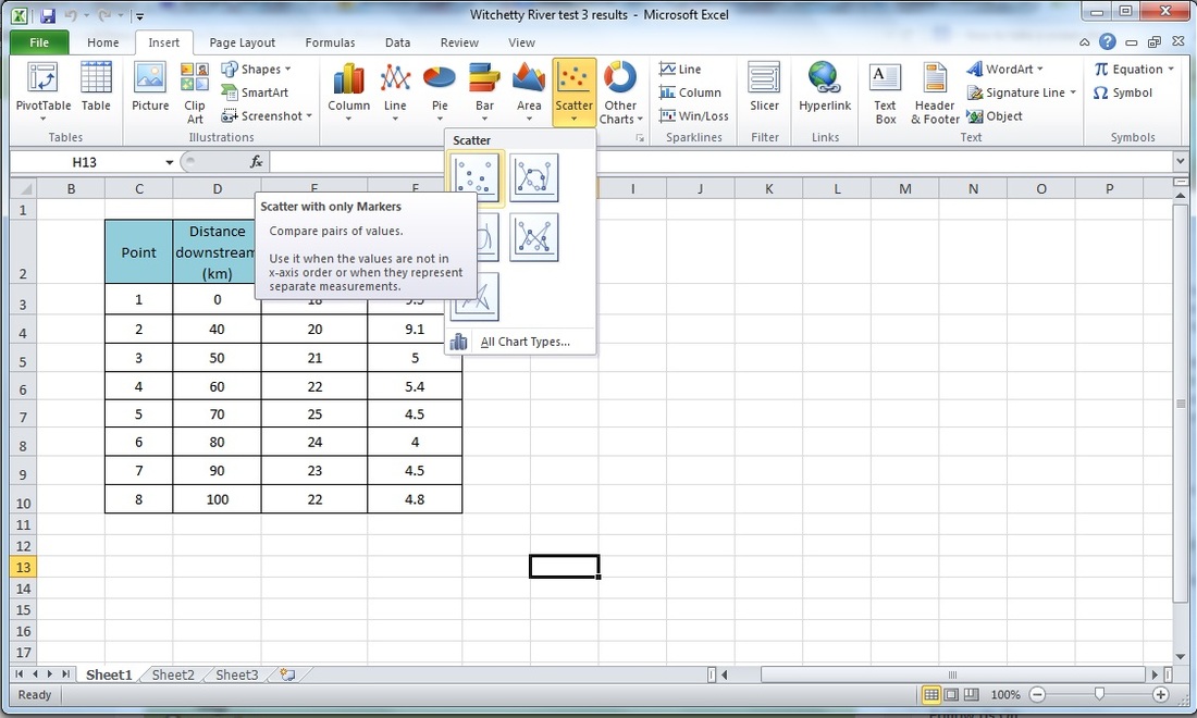
Next we need to insert a scatter plot. So click on an empty cell, then go up to the insert tab at the top of the screen and select 'scatter' and then 'scatter with only markers'. See below.
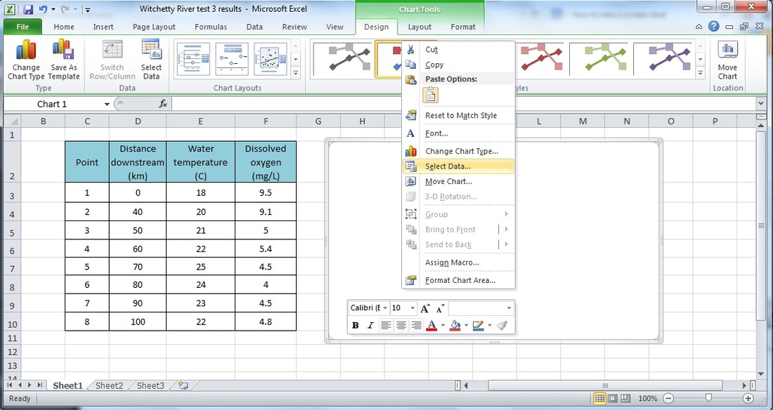
Once you have done that you should end up with something that looks like an empty white box. You then want to right-click on that and the 'select data'.
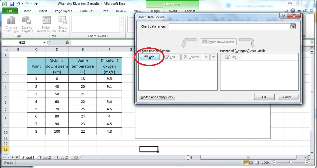
Once you have clicked on 'select data' a dialogue box will pop up. You then need to add a data series.
When you click on the add button a new dialogue box will pop up. Click and hold and move this box so it is not covering your results table. The first set of results we will be plotting is temperature vs distance downstream so name the data series "Temperature".
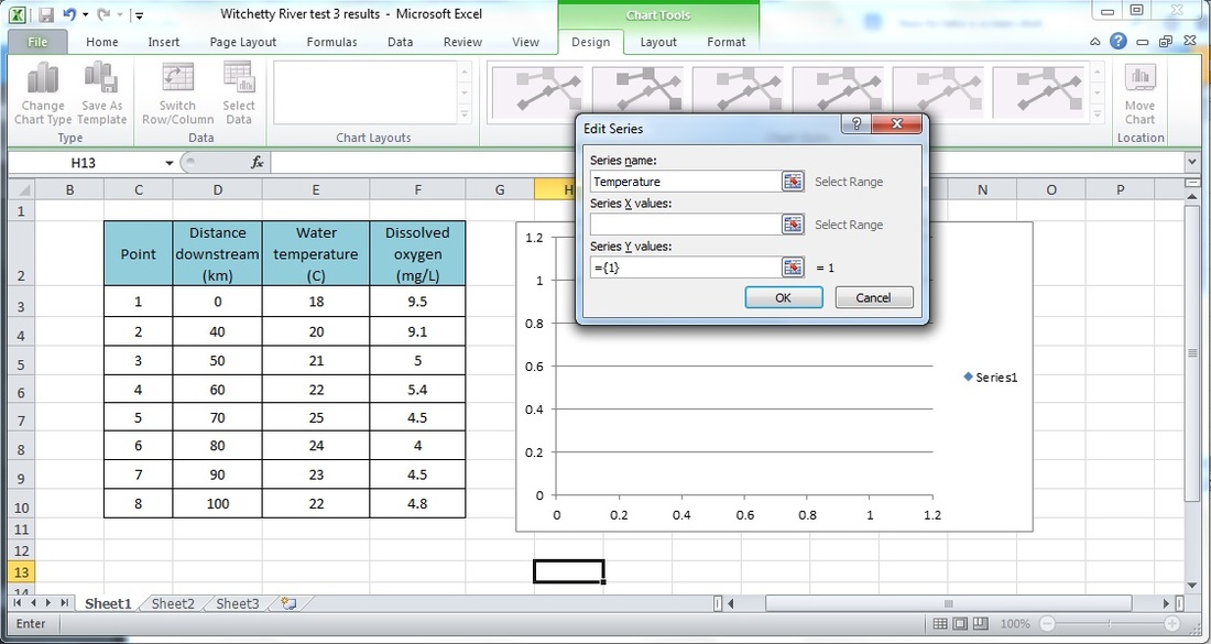
We are now at the stage where we need to select our data. Click on the button to select x values (which are the values for our independent variable, which in this case is temperature.
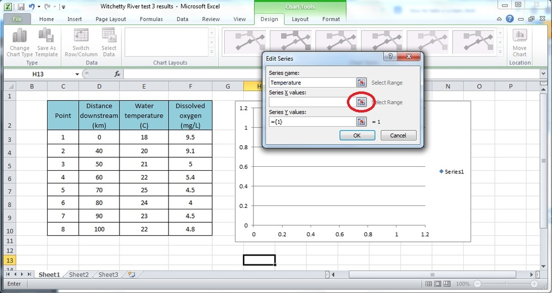
When you have clicked on the button a new little dialogue box will pop up. Don't worry about this one. Just highlight and select all of the values for distance downstream and hit enter. It should look like the screen below.

Now we just repeat the same process for the Y values, which is our dependent variable- in this case, Water temperature. So, click on the little button to select series Y values.

Again, another little dialogue box will pop up; Don't worry about this one. Just highlight and select the values for our dependent variable, water temperature and click enter. You may then click OK to close the other dialogue box. Your screen should now look like this.

You can now repeat the process from here to add another series to the same set of axes. This time you want to again use distance downstream as your independent (x) variable but your dependent (Y) variable will be dissolved oxygen. Once you have completed the process for your second variable your screen should look something like this.
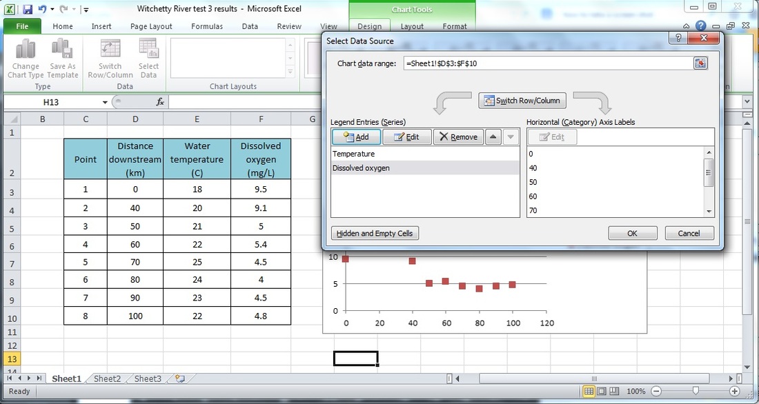
Click OK to close the dialogue box. It is quite difficult to fit a trend-line to this data in Excel so we will just continue to work with the scatter plot as it is. At this stage your graph should look something like the one below.

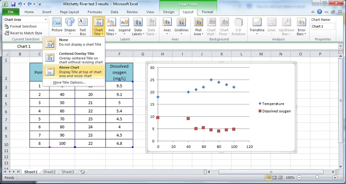
Let's now spend a few minutes making our graph easier to interpret and more visually appealing for presentation in our report. Let's start by adding a heading. Do this by first clicking anywhere on the chart area. You can then click on the 'layout' tab, then click on the 'chart title' button, and finally select to place the label 'above chart'. Finally, make sure you give your chart an appropriate title by clicking and typing in the text box. You will probably also need to resize the text in order for your title to fit neatly.
The next step is to put titles on our axes. Let's start with the horizontal (x) axis title. Click on the chart area, then the layout tab. You can then click on the 'axis titles' button and finally select 'title below axis'. You will then need to label this axis. Make sure you include the appropriate units.

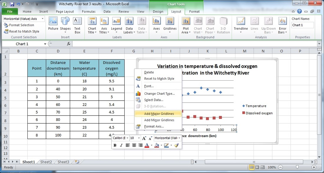
Our graph is nearly done but it looks a bit silly with those horizontal gridlines and no vertical gridlines. Now we will add some vertical gridlines. To do this right click on the x (horizontal) axis

Your graph is now ready to be saved. You may make additional changes if you wish but check with your teacher before you save them.
Now that you have finished your graph it is time to copy and paste it into your logbook and answer the relevant questions.
Once you have finished answering the questions for test 3 you will then need to complete a summary report. See the logbook for details.
Once you have finished answering the questions for test 3 you will then need to complete a summary report. See the logbook for details.
